Friday, February 27, 2009

Jacques Grange - Part Deux

In case you haven't already seen it, Todd Selby has a beautiful look inside the Paris home of Jacques Grange at The Selby. I love the photo of him with the book in front of the Lalanne piece. And those who have already purchased the book are raving about it so start brushing up on your French! Bon Weekend!


Thursday, February 26, 2009

Jacques Grange

Normally I wouldn't post two books in a row but since Jean-Philippe Delhomme created the advertising for The Mark Hotel that Jacques Grange just redesigned, they seemed to work together. I was at Rizzoli yesterday and happened to see the new Jacques Grange book by Editions du Regard and was blown away! I was also blown away by the high price of over $130 so I didn't buy it but that didn't stop two others from snatching it up while I was there! Did I mention that it's completely in French?!

These photos that I found online don't even do it justice. The interior shots are stunning and I can't wait until an English version, Jacques Grange: Interiors is published by Flammarion in September 2009. Of course, my willpower isn't that good so there is a distinct possibility that I will pick the French version but that means I will finally have to sign up for a refresher French class if I expect to actually be able to read it. But then again, a picture is worth a thousand words, especially those I can't understand!


Wednesday, February 25, 2009

The Cultivated Life

For months I had schemed to get a shelter magazine to profile my apartment, but the morning they finally came was, unfortunately, the day after a rather successful dinner party.

I have loved the work of the French artist Jean-Philippe Delhomme since I first saw his advertisements for Barneys and now I am in love with his new book The Cultivated Life! It is witty compilation of "satiric musings" on artistic, literary and decorating dramas and the first published in English! C'est magnifique!

We love entertaining in our dressing room. It's a real conversation piece...even our art world friends are delighted!

Just think of this as the Eames chair of the eighteenth century!

In my apartment a definite aesthetic discipline reigns; the unwritten rules of which don't prevent, unfortunately, a certain common type from loitering here.

Of course it's gorgeous! But I know there's a compulsive minimalist inside of me that could burst out any minute.

The more I progress in the field of design, the more I realize how little I actually know - it's a continual lesson in humility!

Tuesday, February 24, 2009

Breakfast with Carleton

I'm not much of a morning person so I am glad I got up early this morning to attend a Designer Seminar Series event at the D&D building featuring Carleton Varney and sponsored by Traditional Home. Mr. Varney tells wonderful stories of his unplanned life as a decorator that includes clients such as President and Mrs. Jimmy Cartner, Joan Crawford, Ethel Merman and even Joe Nameth. Of course, he also spoke about his mentor and boss for 7 years, the legendary Dororthy Draper. Mr. Varney believes that the younger generation is entranced by Dorothy Draper and her style since she represents an era of American glamour that they never experienced. Even what we think of as glamorous today has nothing on the 1940's and 50's. He also sugested that in this uncertain time, color will become even more popular in decorating. Aren't we all in a little need of a little uplifting color?!

After the lecture, Mr. Varney signed copies of his two fabulous books In the Pink and the latest, Houses in My Heart, in the Carleton V showroom which is run by his son, Sebastian Varney (above). My friend Kelly Reynolds was a designer at Dorothy Draper and worked on the Oscar Greenroom last year but now she helps run Carleton V with Sebastian who owns a country house near Christopher Spitzmiller who I was excited to finally meet today. Christopher has a great farm (with chickens!) that he has been restoring for a few years and I can already imagine that it will be just as gorgeous as his New York abode! Their new country neighbor is Eddie Ross who's home I can't wait to see! Talk about small chic world!

During the week, Sebastian Varney lives in a beautiful apartment on the Upper East Side that just needs a few finishing touches before I can photograph it for the blog. While his father's work is full of bold bright color, Sebastian's is a little more subdued but by no means boring. I am going to keep pestering him to complete the last projects because I know you will love it (if he doesn't strangle me first!). I'm sure Sebastian has heard his father's stories a million times but I haven't so I thoroughly enjoyed listening to him this morning. I will also try to remember his advice as I establish my own design firm, "successful rooms have soul." Amen!

Monday, February 23, 2009

Tranquil Townhouse

I was looking for a a living room concept recently and came across the townhouse that Nate Berkus designed for Katie Lee Joel and it reminded me how much I loved this home when I first saw it. While I enjoyed looking at the spread in Domino, I always liked looking at the photos online without them obscured by text or folded in the middle. I'm also sure that everyone has seen it before but sometimes it's nice to revisit an old favorite especially when it has a beautifully serene color palette and simply perfect furnishings. Also, makes me wish I lived in a pretty townhouse in the West Village. Sigh.


Photos by Paul Costello

Berkus at the Beach

I was checking out interior designer Nate Berkus's website and noticed a few new photos of a beach house. I posted them yesterday without knowing where they were from and in a funny coincidence, they were published in the November 2008 issue of C Magazine (more on C Magazine later) and now I can bring you the entire story.

The 3,400 SF home is tucked away on a beach in Malibu and of course, has amazing views of the ocean. Nate was called by the lucky homeowner who was given a complete house makeover for her birthday and couldn't resist the offer to help her. As I mentioned before, the home is a beautiful mix of black, white and browns mixed with natural fibers since the owner is not a color person which creates a clean and calm interior. It's also nice the decor does not compete with the amazing views. In the living room above, the Corian topped table was designed by Berkus and sits near a 1940's carved giltwood chair and what appears to be a Mies van der Rohe daybed.

A glass desk and wood chair overlook the living room in the study that closes off to become a guestroom.

Petrified wood looks like modern art on the wall of the stairwell.

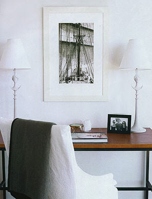
The downstairs guestroom has a leather topped desk and a photograph taken by a Navy admiral who was a family ancestor.

In the master bedroom, a zebra skin rug adds pattern to the neutral color scheme, as does the Ross Bleckner painting and agate lamps.

Can you just imagine taking a bath with that view? Looks very dreamy!

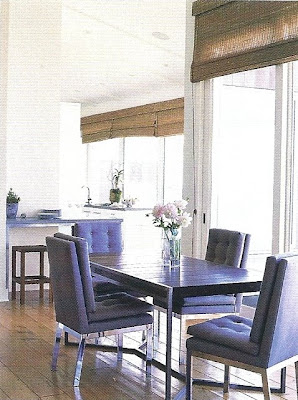
The dining chairs look blue but are really gray. Another variation on the colors through out the home and take their cue from the colors of seashells and the colors of the beach.

The kitchen has a more industrial feel but Berkus says, "I like things with a touch of the industrial." The floors are softened with seagrass rugs. I think this home is going to have to go into my file of inspiration for my future beach house. It's perfect!


Photos from Nate Berkus and Lisa Romerein for C Magazine

Sunday, February 22, 2009

Designer to Watch

The saddest part of the demise of Domino magazine was that many designers had already been photographed for the April issue which always includes the "10 Designers to Watch." I was so excited for my friend Grant K. Gibson when he confided that he was one of the 10. Needless to say, he was over the moon and spent many hours getting ready for the photo shoot only to find out that those photos would never be published.

But when one door closes, another usually opens and Grant has just had a lovely feature on him published in the San Francisco Chronicle recently, and I'm not just saying that because he gives me a shout out! Grant really is one to watch and I have no doubt that his designs will be featured in many magazines to come, if not on the cover! In the meantime, I will continue to enjoy his blog, check out his new items for sale and follow his advice...
"Design is a process, not a product. You can't force it and you don't want to buy out of desperation. If you take your time and let it come naturally, you'll make less mistakes. It's OK to have holes in your home until you find the right piece, even if it takes years." - Grant K. Gibson

Saturday, February 21, 2009

Fashion and Design

The award for the most literal pairing of fashion and design came from Bryan Bradley the designer of Tuleh who showed his Fall 2009 collection in the Roubini Casa showroom at the New York Design Center where he is also debuting a new line of rugs. Tuleh is known for beautiful prints and feminine silhouettes and it will be interesting to see how they translate the patterns into rugs beyond those that you can see in the "runway" photos here.

Bradley's inspiration for the fashion this season was the book Them: A Memoir of Parents by Francine du Plessix Gray which tells the story of her parents, Alexander Liberman, an artist who would later head Condé Nast and Tatiana du Plessix, a model and society milliner, and their resourcefulness as Russian émigrés. I have this book on my shelf but haven't had time to read it yet. I hope when I do that it inspires my designs as it did Bryan's fashions!


Photos from Style.com

Friday, February 20, 2009

Georgia's Home on My Mind!

After seeing Georgia Tapert's store, I had no doubt that the home she shares with her fiance would be a chic reflection of her love of travel and her eye for interesting pieces and I wasn't wrong. I also appreciate that she wasn't afraid to mix in a few new pieces from places like West Elm and Crate and Barrel. She kindly offered to share photos and I hope you enjoy them!

The elevator opens up directly into the apartment so created a welcoming vingette with a dresser that her mother grew up with in her home and vintage lamps she found in an antiques shop in New York that are possibly from the 1950's. The painting above is by Michael Ray Charles and the rug was picked up in India.

I love that she floated the sofa from Mitchell Gold in the middle of the room and wish more people would try this set up. The light Belgiun linen upholstery is the perfect neutral back drop for the custom green Belgian linen pillows with chocolate brown velvet borders. The vintage coffee table was found at John Derian while the box on it was brought back from a trip to Vietnam. The metal desk in the back is vintage.

The 1950's end tables with smoked mirror tops were found for a steal at an estate sale and are topped with lamps from Crate and Barrel. The shell lanterns are from a shop in New York that sells Moroccan pieces. I'm going to have to work on finding the name.

The hand painted burlap floor pillows can be found at Georgia Tapert Living and the vintage 1930's leather club chairs belonged to Georgia's fiance. The plantation chair in the corner is from India c. 1850s that was reupholstered in a glazed linen stripe from Rogers & Goffigon. I think I've mentioned them before but Rogers & Goffigon make some of the best fabrics for vintage pieces since none of the colors or fabrics look too new.

The parchment top dining table is part of Carolina George collection available at Georgia Tapert Living and has mahogany bases with nickel banding on bottom. The stools are vintage and the artwork is actually pages from a book of Andy Warhol's early work as an advertising illustrator that she had framed. This is an idea that a lot of designers use since you can get an instant collection of artwork for usually not a lot of money.

The bar cart is vintage and I think my favorite thing in the apartment has to be the 1950's planter that Georgia uses as an ice bucket when they entertain! I think that is such a chic idea and there are more for sale in the store!

Georgia and her fiance painted the back wall of the bedroom a dark gray/blue to create a headboard effect until they could find a bed they liked. This is a great idea for small apartments that might have room for a headboard. The color also sets of the series of works by Duane Michals. The bedside tables are vintage English telephone tables that Georgia lacquered herself in slate color and sitting on them are old lamps from CB2. I think the pièce de résistance is the fabulous bedding from Olatz the fabulous shop owned by Julian Schnabel's wife.

I think Georgia's home is not only a great reflection of her style but great way to live these days. There is that wonderful mix of family antiques, vintage furniture, pieces picked up traveling, things that were painted or repurposed, and new items from big retailers that creates a uniquely personal home. But then again, I didn't expect anything less from the chic and gracious Georgia Tapert!